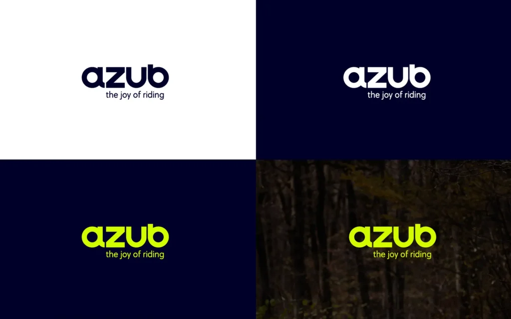
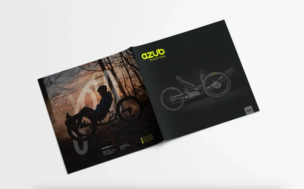
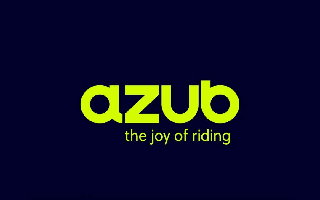
You may have already noticed that at Cycle-Con in Ohio, USA, we launched our new logo and other graphic elements that will determine the future appearance of AZUB. But it’s not just the new logo, it’s the whole visual identity. In recent months we have gone through a process that in our case is technically called rebranding. And it has been a rather time-consuming but very fun journey.
Why did we embark on this journey at all? The logo you were used to was actually our second logo, but it had been with us since 2003. Over time, we have gradually modified it to fit our needs and also to fit our modern look. However, after more than twenty years, it was necessary to change the logo, to unify the already somewhat fragmented graphics and to show clearly the modern approach we have not only to our marketing, but especially to the bikes we build. Plus, we thought it would make a nice gift for the company’s 25th anniversary, which we will be celebrating next year.
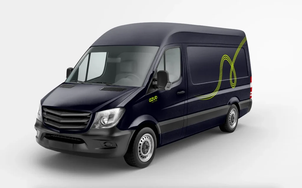
How did we come up with the new look? It came about through several workshops with the professionals who worked on the rebranding. We had to answer a lot of questions within the company and go back to the roots of what we were doing and to realize why AZUB exists in the first place. Among other things, we also imagined what AZUB would be like as a person and how it would differ from Ales Zemanek, the CEO of AZUB, or from other people in the company. And since many members of the AZUB team, which is very much a kind of family, were involved in the whole process of creating the new logo, it is not surprising that the AZUB person resembles us in many ways. It’s a man in his 40s who has two kids, lives in a small town, and drives a light-colored van with a hybrid powertrain. He’s an enthusiast for all things outdoor. He likes comfortable sportswear, but has no problem dressing up in a suit and going to a formal event. He’s a do-it-yourselfer who is interested in new technology, but doesn’t necessarily use it all, right away. This part in particular was a lot of fun. The image you see on the right, is an AI generated picture of such a guy.

We have also gradually defined that AZUB’s mission is to be a stable and reliable company that connects a wide community of brand supporters, including not only customers but also employees, through friendly and open communication. Our commitment is then a constant focus on company culture, company development and product innovation enabling people to push their limits through cycling. The company’s core values are quality, sustainability and humanity.
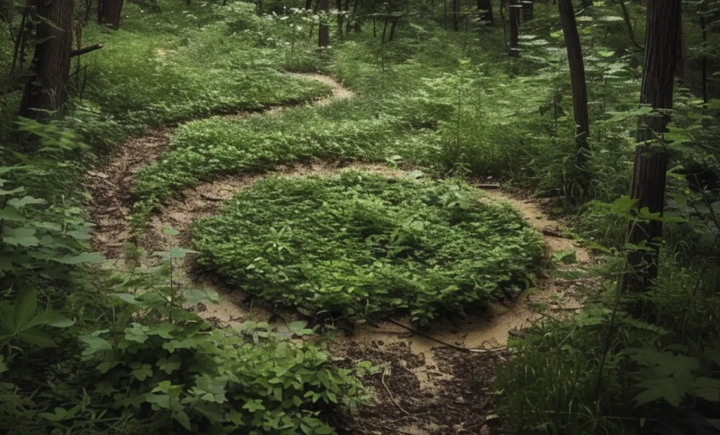
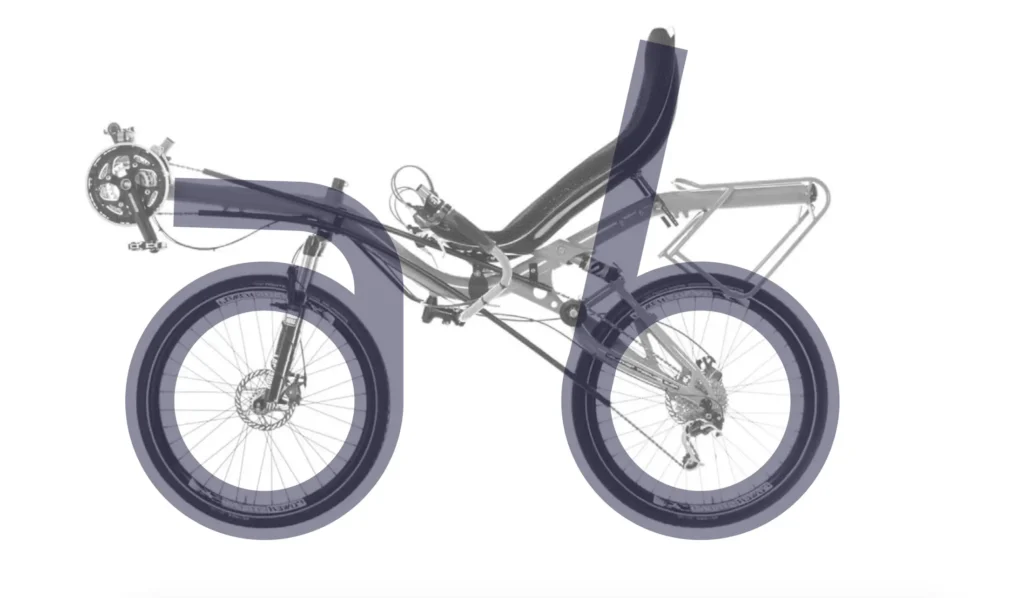
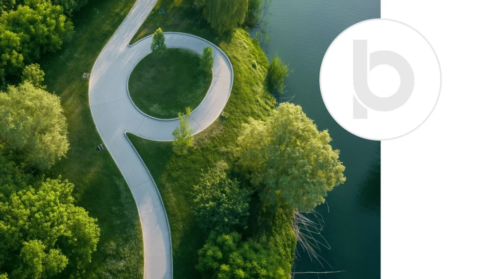
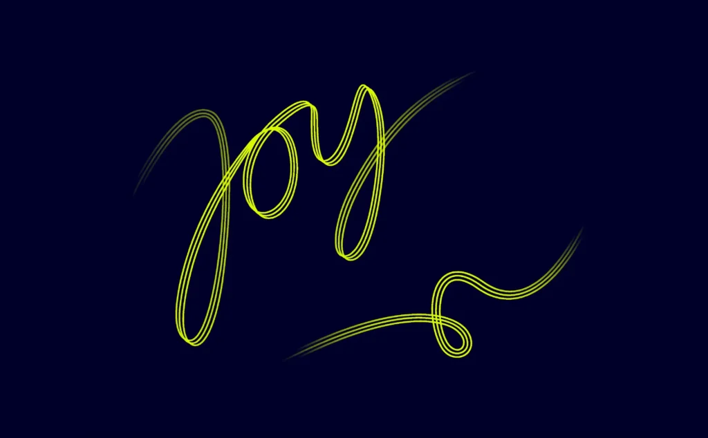
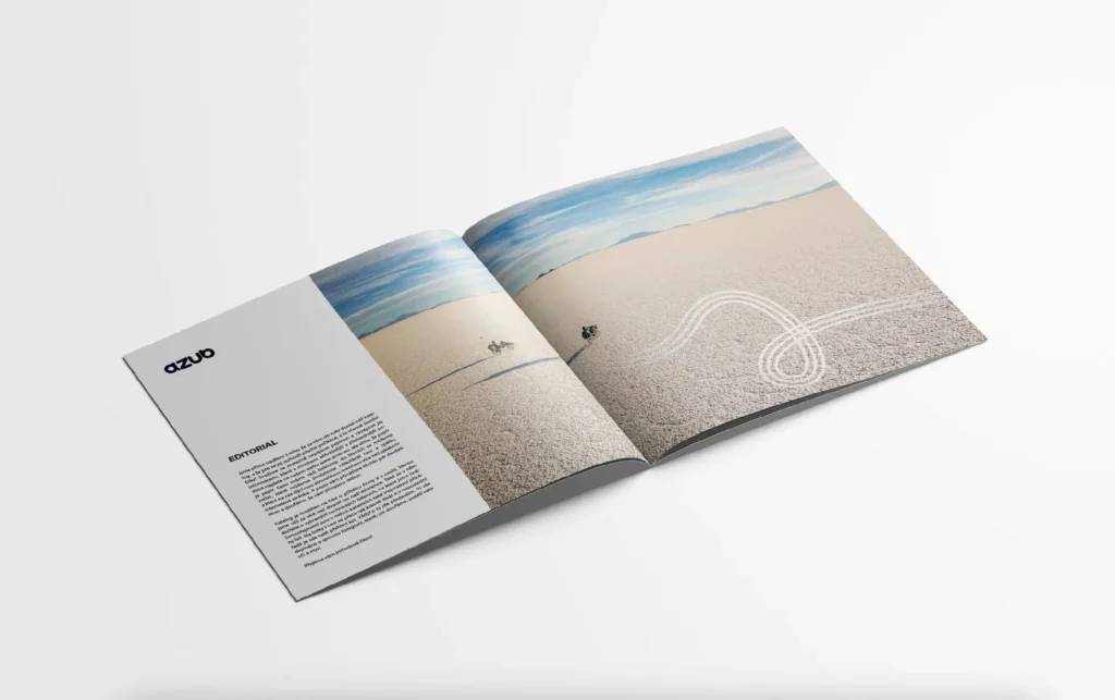
There were also interesting shape connections that helped the graphic designers create the new logo and individual elements. They looked at the shape of our recumbent bike. They imagined the joy that a trike rider has when they sit on it and go for a ride. They thought about what roads he enjoys riding on and what a tricycle “donut” looks like. They then translated all of this into a new logo, in the shape of the word “JOY”, in three lines that symbolize the tracks of a recumbent trike. You will see them not only in the supporting graphics, but also in the symbol “a”, which is a kind of complement to our logo.

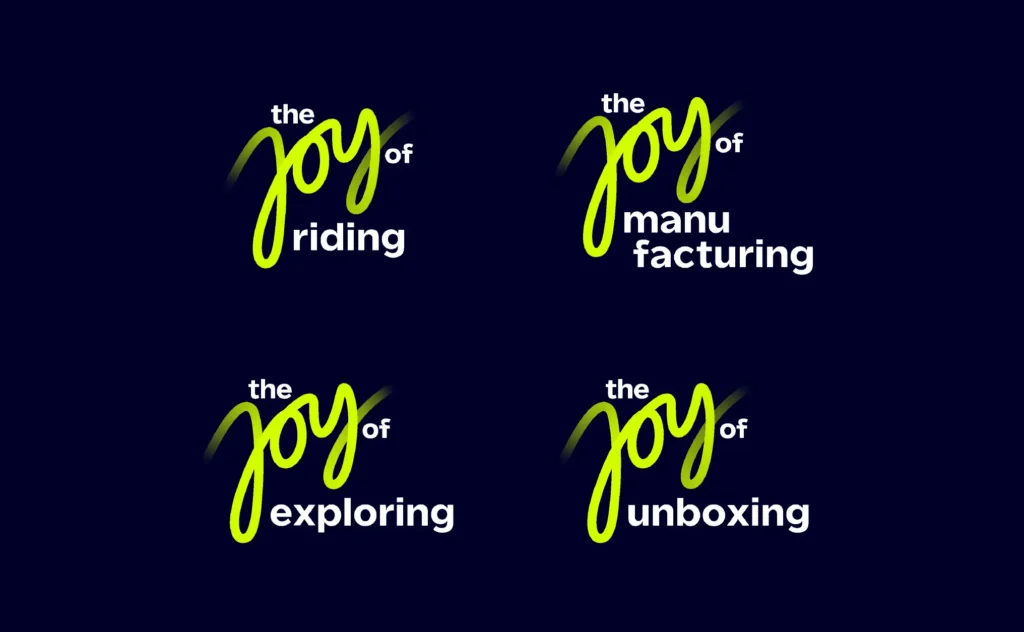
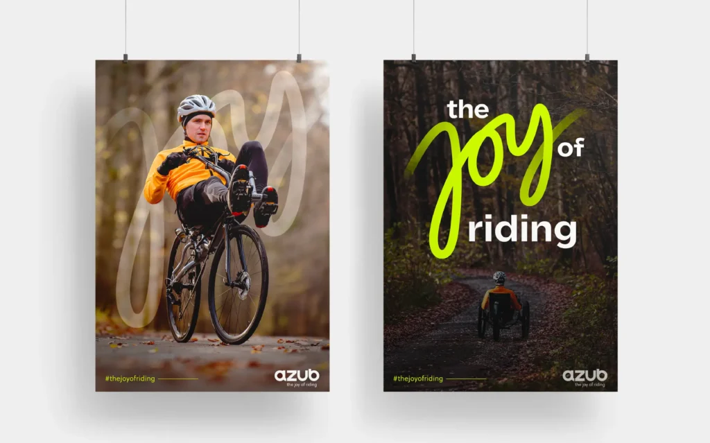
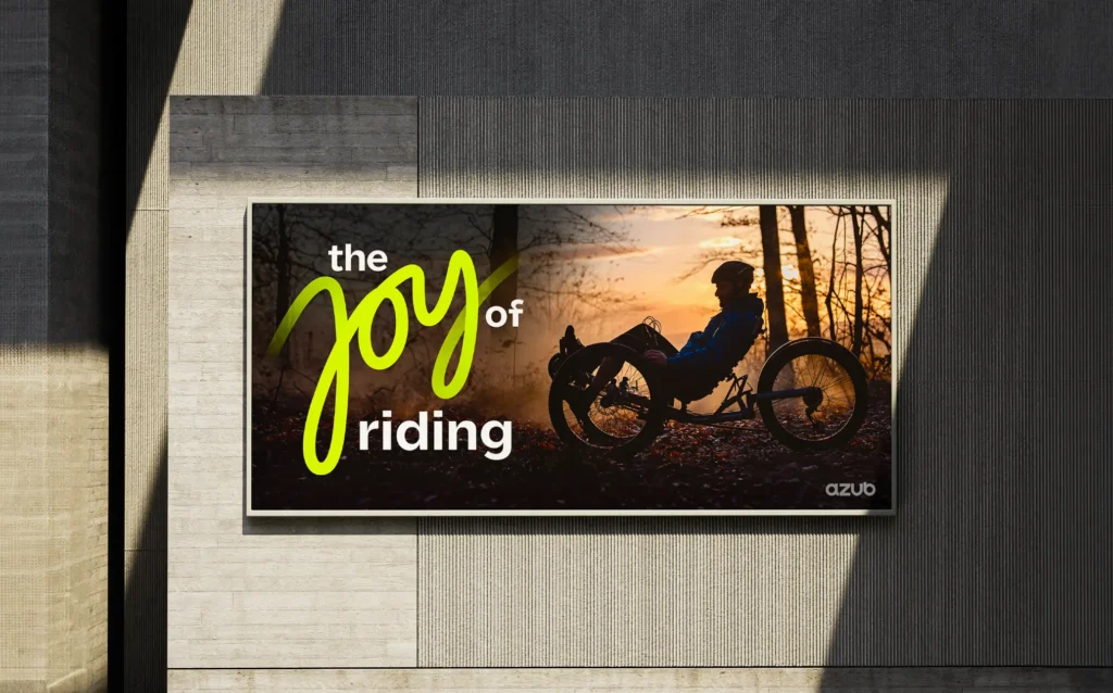
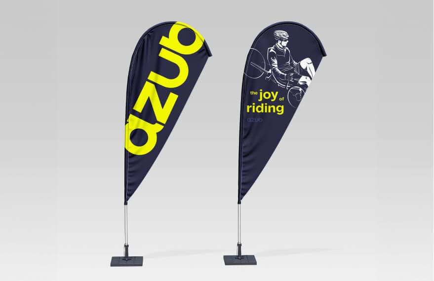
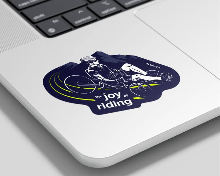
Also important is the motto or slogan, which expresses our basic approach or feeling. And that feeling is clearly “JOY”. The joy of bringing joy to people. The joy of riding, of discovering, of new exploring new horizons. We will work a lot with the slogan “The JOY of riding” and its variations in the future.
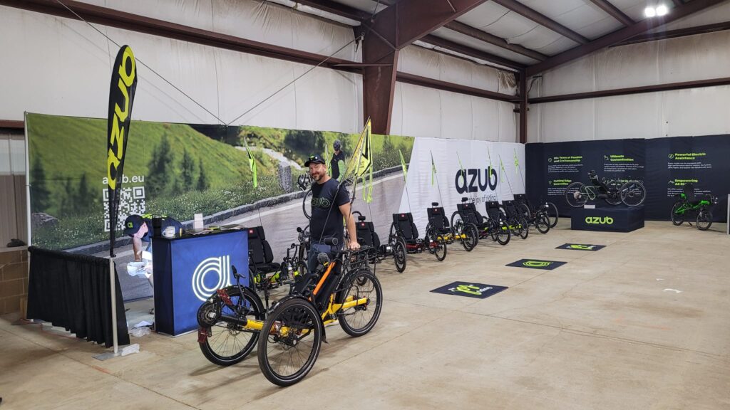
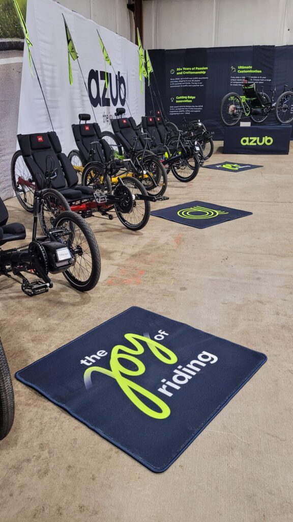
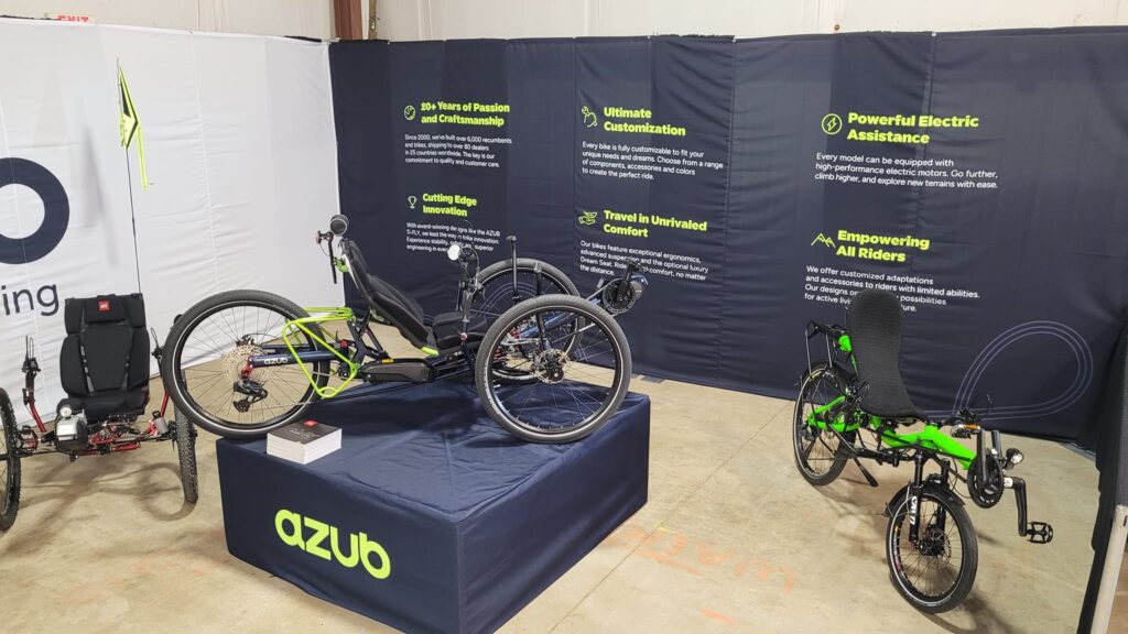
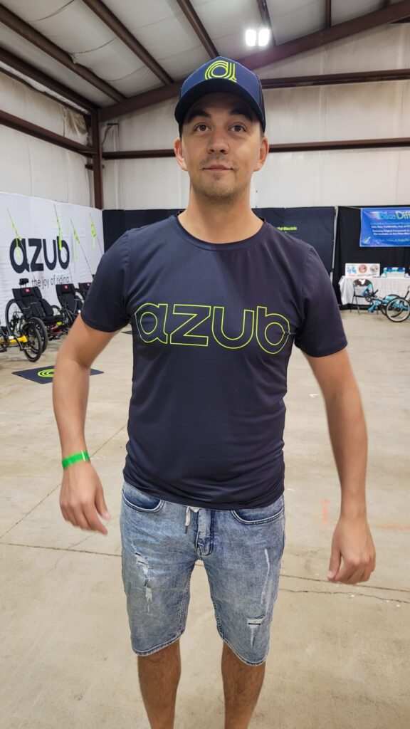
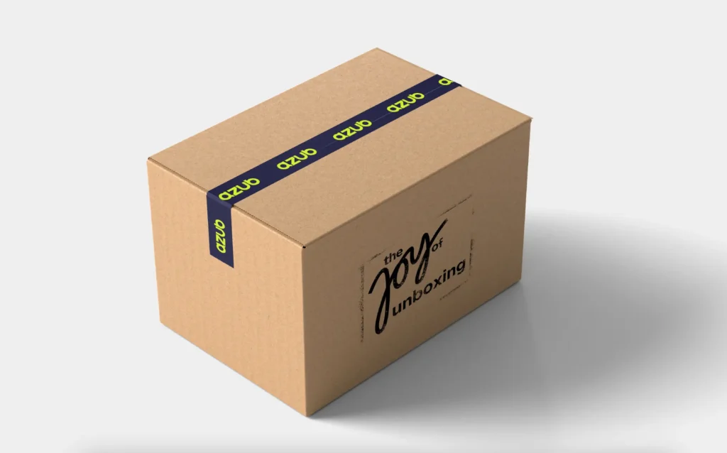
We first showed our new visual identity at Cycle-Con and people’s enthusiasm for it exceeded our expectations. The people in the AZUB team alone were delighted with the new t-shirts and baseball caps, which they proudly wore throughout the trade show and throughout our trip in the US and Canada. Plus all the flags, carpets, banners, stickers, mugs, etc. Our recumbent and trike owners were asking where they could buy new stuff and if we had new frame stickers so they could replace them. People who don’t ride AZUBs and even employees of some competing brands have also come to ask for some promotional materials. Just great. The new visual identity is simply very successful and makes us very happy.
And who is behind it? The marketing agency Koncepto from Brno and the whole team around Michal Pokorný are behind it. Our marketer Honza Galla has known Michal for more than twenty years, AZUB has worked with him many times, and since Michal has a huge experience in outdoor and cycling, our choice was clear. We would like to thank them all very much, because the result of their work is really worth it.
So the foundation is already there, but it will take us quite some time to implement all the new graphics in the real world. It’s quite easy to replace the logos and selected photos in the online environment. Printing new banners is not difficult as well. However, inancially and time-wise it will be more challenging to replace all the materials at our dealers, print new catalogues and most importantly develop a completely new website, which we are already working on. That is why you will still see our old logo here and there. However, you may already enjoy the new one. Let us know in the comments how you like it.


Join the worldwide group of AZUB fans
Get the latest stories, be inspired by our amazing builds and get some inside view.
You are close to join the fan group. Just see your inbox and confirm your e-mail address.